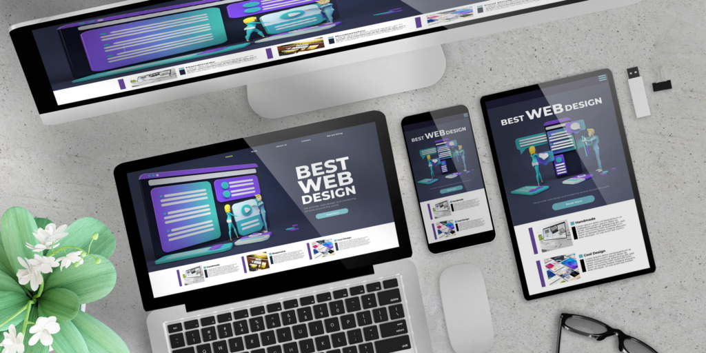
There are numerous different types of devices that are web-access capable ranging from smartwatches to large TVs. These devices have many different screen display sizes and resolution types.
According to Statista, a leading business statistics, and facts reporting platform, as of the 3rd quarter of 2020, more than half (50.81%) of web traffic globally is generated from mobile devices. This statistic is important in web development in that it highlights that websites need to be responsive and web user-friendly, across a variety of mobile devices to keep on track in a rapidly evolving technological era.
What is Responsive Website Design?
Designing web content that automatically structures webpages to different devices’ capabilities so that the webpages are user-friendly is called Responsive Web Design.
☐ Some Devices Are:
- Phones
- Desktop Computers
- TVs
- Laptops
- Smartwatches
☐ Constraints Of These Devices Include:
- Different Screen Display Sizes
- Various Processing Powers
- Many Types of Resolutions
Responsive Web Design (RWD) focuses on designing web content that is user-friendly, responding to the needs of the web user, and also responds to the various capabilities of the device being used to access the web. When programming a website’s design to be responsive across numerous devices, both a computer programming language like HTML code and CSS are used.
How to Make a Responsive Website Design
→ Set the Meta Viewport Tag (HTML)
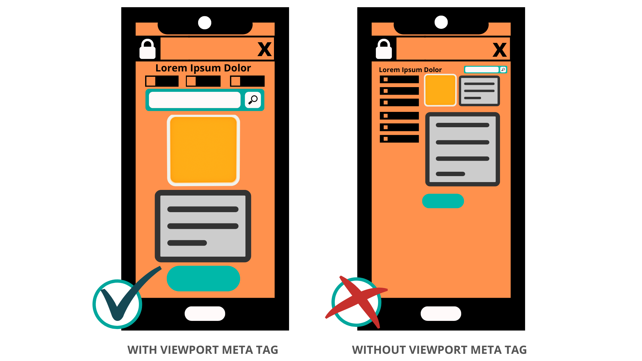
A meta viewport tag instructs the web browser to structure a page’s scaling and dimensions accordingly to the web-enabled device that is being used. Without the meta viewport tag, web pages are displayed with the default desktop settings or the mobile device’s default settings which neither almost certainly doesn’t render a responsive web design on mobile devices.
Webpages with an absent meta viewport tag cause inconsistencies in the webpages font sizes, having to zoom pages out and in to view web content, and difficulties interacting with the web page’s content (e.g. clicking buttons and/or hyperlinks) resulting in a subpar, unresponsive webpage experience.
In order for webpages to be web responsive for a variety of devices, a meta viewport tag must be placed at the head of the document. It should look similar to the meta viewport tag in the box following :
<!DOCTYPE html>
<html lang="en">
   <head>
   …
<meta name="viewport" content="width=device-width, initial-scale=1.0">
   …
   </head>
…
The default meta viewport value [width=device-width] adjusts the webpage pixels accordingly to the device screen width which the page is being viewed from. An independent pixel (single pixel) may consist of many pixels on a high-resolution device screen to create a high-quality image.
For the initial zoom level when first visiting a webpage, [initial-scale=1.0] is used to establish a 1:1 structure between the device’s pixels and the CSS pixels. This allows for the webpage to be displayed at the full landscape of the device display screen regardless of the device orientation (portrait or landscape). In addition, the meta viewport tag can be customized with the following attributes:
[maximum-scale] This property adjusts the maximum amount a webpage can be zoomed.
[minimum-scale] This property adjusts the minimum amount a webpage can be zoomed.
[user-scalable] This property allows for the webpage to be zoomed in and out. Values are either yes or no.
It’s recommended that these additional attributes are used accordingly to the level of needed responsiveness for a webpage. This is because these values may cause accessibility issues for the webpage user.
Need Help Building Your Website? Try Namecheap FREE Website Builder.
→ Scale Images According To Viewport (CSS)
In order for an image to be adjusted accordingly to fit the device display screen on which it is being viewed, the following code is placed within the CSS:
img {
   max-width: 100%; <!-- Use (width: 100%;) in Internet Explorer-specific style sheet -->
   display: block;
}
Using the setting [max-width: 100%] will size the image dimensions to fit a device’s screen, rather than having a scroll bar along the image if its fixed dimensions are larger than the viewport. If needed, use the setting [width=100%] instead and this will keep the image at its fixed dimensions and add a scrollbar to the image if the image dimensions are larger than the webpages viewport.
→ Add An <image> Element (HTML)
To help with the switching of an image resolution (image resizing) for a variety of web browsers, an <image> element can be used in the webpages HTML. Most modern browsers will use the information from the <image> values to reserve webpage space for the image before it is shown on the webpage to help avoid layout shifts while content on the page loads.
The use of the <image> element can also save web users a lot of bandwidth. The following HTML is supported by many modern mobile and desktop browsers, although Internet Explorer does not support the elements ([srcset] and [sizes]) currently. Instead, the Internet Explorer web browser will just load the image mentioned in the attribute [src].
<img srcset="flying-eagle-740w.jpg 740w,
             flying-eagle-1080w.jpg 1080w"
     sizes="(max-width: 800px) 740px,
             1080px"
     src="flying-eagle-1080w.jpg"
     alt="Flying Eagle">
The values of the [srcset] element give the web browser a set of images with the image’s sizes to choose from. The [srcset] attribute is defined by:
- The image filename ([flying-eagle-740w.jpg])
- Each is followed by a space.
- Then the image’s intrinsic width in pixels ([740w]).
The values of the [sizes] element are media conditions and instruct the web browser what image size is best to choose according to certain media conditions when are true. The [sizes] attribute is defined by:
- The media condition [(max-width:800px)] which in this example is stating that “when the viewport width is less than 800 pixels”.
- Followed by a space.
- Then the width of screen space [740px] which the image is to fill if the media condition is true. The [1080px] is a default width which means it has no media condition and is the width of screen space chosen for the image when no media condition is true. Web browsers choose the first matching condition listed, so the order in which the width of screen space needed for the image should be listed accordingly.
The [src] tag specifies the image URL [flying-eagle-1080w.jpg]) to be displayed. The [alt] tag is text ([An Image of a Flying Eagle]) that may be displayed in place of the image it defines.
→ Use A <picture> Element for Art Direction and Image Format Support(HTML)
The <picture> element tag gives the web developer the flexibility to list multiple images with different conditions (e.g. image format, image width) so that the best image will be displayed on a device according to that device’s specifications (e.g. viewport).
A <picture> element contains zero or more <source> elements and one <img> element. The <picture> element allows the web browser to choose from different variations of an image or/and an entirely different image according to the <source> elements [media] condition specifications. An example syntax for using the <picture> element tag for art direction follows:
<picture>
  <source media="(min-width: 700px)" srcset="green-car.jpg">
  <source media="(min-width: 450px)" srcset="jogging-shoes.jpg">
  <img src="coffee-cup.jpg" alt="Coffee Cup" style="width:auto;">
</picture>
The above <picture> element syntax states: If the first [media] condition [(min-width: 700px)] is true to display the [srcset] image [“green-car.jpg]. If false, the web browser then sees if the second [media] condition is true. If none of the <source> [media] conditions are true, the <img> [src] [“coffee-cup.jpg”] is displayed. The <picture> element tag can also be used to add image formats.
Not all image formats are supported by some devices or web browsers so the <picture> element tag allows the browser to select the first image format it recognizes so that an image will be displayed accordingly to a device’s specifications. An example syntax for using the <picture> element for image format support follows:
<picture>
  <source srcset="office-desk.gif">
  <source srcset="pen-and-paper.png">
  <img src="printer.jpg" alt="Printer" style="width:auto;">
</picture>
→ CSS Media Queries
When making a webpage layout design adaptable for a variety of device display screen sizes and for different media types (e.g. printers, screen readers); CSS media query rules are applied to adjust webpages features to make a responsive webpage design.
Media queries are applied to CSS to change the style and/or adjust webpage functions accordingly to the web-capable device being used. Some features on webpages that can be adjusted accordingly to various devices using CSS rules are:
- Width and Height
- Orientation (Portrait or Landscape)
- Printing Style
- Font Sizes
- Background Colors
The following syntax is a basic example of a CSS media query:
@media media type and (media feature rule) {
  /* CSS rules goes here */
}
The media type tells the web browser what type of media the code is to be applied to. The types of media that can be specified are:
- [all] (This will apply the CSS rule to all media types.)
- [screen]
- [print]
- [speech]
The media feature rule is specified and if true; the CSS rules that are set then after will be applied. The following CSS syntax is an example:
/* Background color of body is set blue */
body {
  background-color: blue;
}
/* Device screens that are 1200px or less, background color of body is set to green */
@media screen and (max-width: 1200px) {
 body {
  background-color: green;
  }
}
/* Device screens that are 768px or less, background color of body is set to orange */
@media screen and (max-width: 768px) {
  body {
    background-color: orange;
  }
}
* Please note: Media queries can also be applied in HTML and JavaScript. For more information on media queries, visit A Complete Guide to CSS Media Queries from CSS-Tricks.com.
→ Building A Responsive Webpage Layout Design (HTML using ASCII Art)
To help ensure a responsive webpage design across a variety of devices, in conjunction with a meta viewport tag, it’s recommended to build webpages with responsive webpage layouts. The following responsive webpage layout design is one example of many using HTML and ASCII art to create a responsive grid webpage layout:
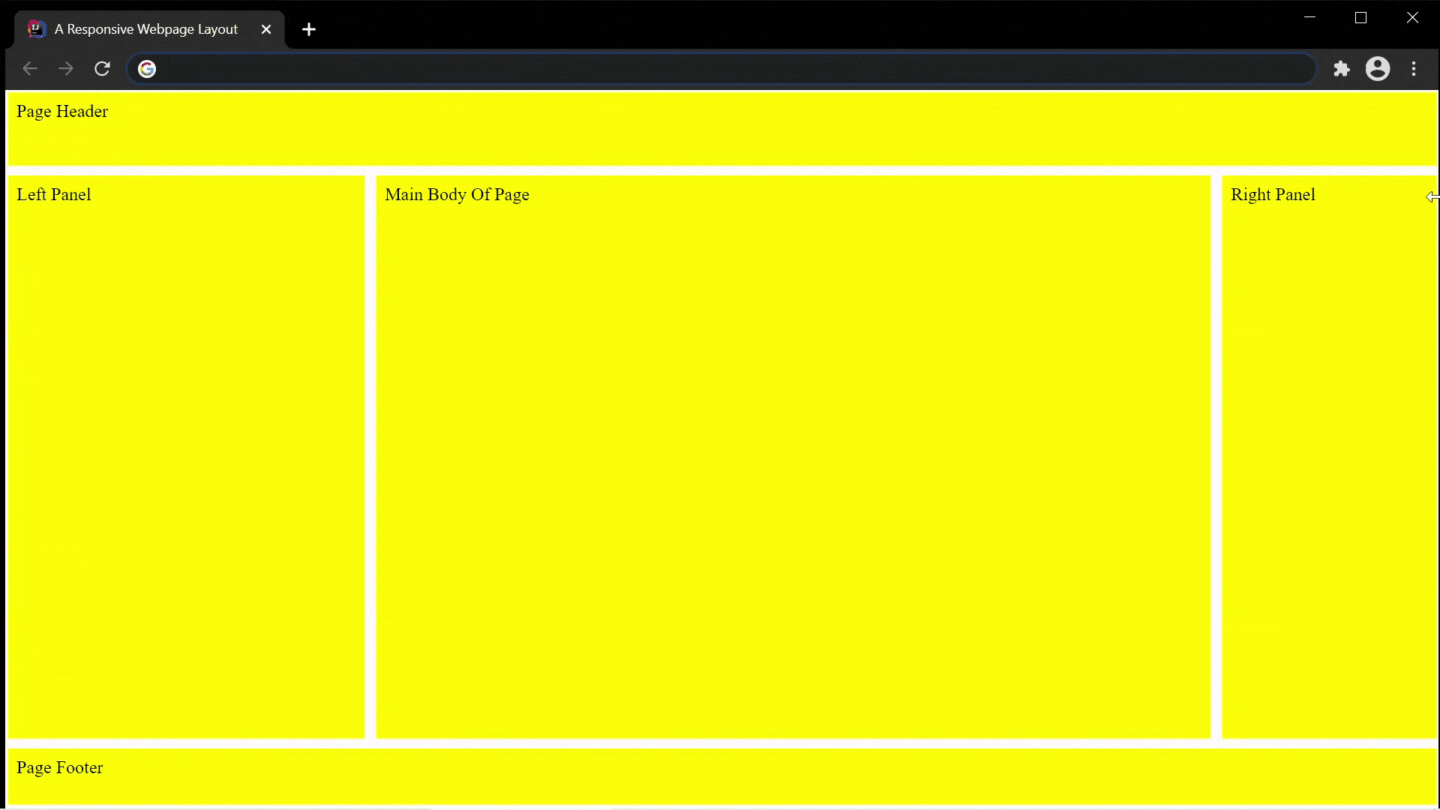
A Responsive Webpage Layout Design
The syntax used to create the above responsive webpage layout design:
<!doctype html>
<title>A Responsive Webpage Layout Design</title>
<meta name="viewport" content="width=device-width, initial-scale=1.0">

/*HTML Markup*/
<boxes>
<header id="pageHeader">Page Header</header>
<main id="mainBody">Main Body Of Page</main>
<left id="leftPanel">Left Panel</left>
<right id="rightPanel">Right Panel</right>
<footer id="pageFooter">Page Footer</footer>
</boxes>
<style>
    /* ASCII Art */
    boxes {
        display: grid;
        grid-template-areas:
    "header header header"
    "left main right"
    "footer footer footer";
        grid-template-rows: 65px 2fr 50px;
        grid-template-columns: 25% 2fr 10%;
        grid-row-gap: 9px;
        grid-column-gap: 10px;
        height: 100vh;
        margin: 0.5px;
    }
    /* CSS Rule instructs to stack the layout accordingly to small screen devices and/or viewports */
    @media all and (max-width: 600px) {
        boxes {
            grid-template-areas:
      "header"
      "main"
      "right"
      "left"
      "footer";
            grid-template-rows: 90px 0.5fr 65px 0.5fr 60px;
            grid-template-columns: 2fr;
        }
    }
    header, footer, main, left, right {
        padding: 0.5em;
        background: yellow;
    }
    #pageHeader {
        grid-area: header;
    }
    #pageFooter {
        grid-area: footer;
    }
    #mainBody {
        grid-area: main;
    }
    #leftPanel {
        grid-area: left;
    }
    #rightPanel {
        grid-area: right;
    }
</style>
Looking For Fast, Affordable, and Reliable Web Hosting. Try Shopify.
Conclusion
There are many ways to design a webpage to be responsive. The technological evolution is ever-changing and so should webpages on the many devices available. Responsive web design helps to make webpages user-friendly and aesthetically pleasing.


Leave a Reply
You must be logged in to post a comment.